# 几个特殊的css属性
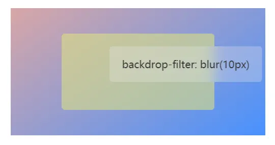
# backdrop-filter
其属性值同filter,参考mdn backdrop-filter
# 毛玻璃特效
<div class="container">
  <div class="box">
    <p>backdrop-filter: blur(10px)</p>
  </div>
</div>
1
2
3
4
5
2
3
4
5
.container {
  align-items: center;
  display: flex;
  justify-content: center;
  height: 200px;
  width: 400px;
  background-image: linear-gradient(145deg, rgb(217, 166, 166), #4791ff);
}
.box {
  font-family: sans-serif;
  text-align: center;
  max-width: 80%;
  max-height: 80%;
  padding: 20px 0;
  border-radius: 5px;
  background-color: rgb(219 224 132 / 60%);
}
p {
  background-color: rgba(233, 233, 233, 0.3);
  border-radius: 5px;
  transform: translateX(75px);
  color: #333;
  -webkit-backdrop-filter: blur(10px);
  backdrop-filter: blur(10px);
  line-height: 1;
  padding: 20px 20px;
}
1
2
3
4
5
6
7
8
9
10
11
12
13
14
15
16
17
18
19
20
21
22
23
24
25
26
27
2
3
4
5
6
7
8
9
10
11
12
13
14
15
16
17
18
19
20
21
22
23
24
25
26
27
# filter
属性参数摘自于 CSS3 filter(滤镜) 属性
| 属性 | 描述 |
|---|---|
| /* Use no filter */ | |
| none | 默认值,没有效果。 |
| /* <filter-function> values */ | |
| blur(px) | 给图像设置高斯模糊。"radius"一值设定高斯函数的标准差,或者是屏幕上以多少像素融在一起, 所以值 大越模糊; 如果没有设定值,则默认是0;这个参数可设置css长度值,但不接受百分比值。 |
| brightness(%) | 给图片应用一种线性乘法,使其看起来更亮或更暗。如果值是0%,图像会全黑。值是100%,则图像无变化。其他的值对应线性乘数效果。值超过100%也是可以的,图像会比原来更亮。如果没有设定值,默认是1。 |
| contrast(%) | 调整图像的对比度。值是0%的话,图像会全黑。值是100%,图像不变。值可以超过100%,意味着会运用更低的对比。若没有设置值,默认是1。 |
| drop-shadow(h-shadow v-shadow blur spread color) | 给图像设置一个阴影效果。阴影是合成在图像下面,可以有模糊度的,可以以特定颜色画出的遮罩图的偏移版本。 函数接受<shadow>(在CSS3背景中定义)类型的值,除了"inset"关键字是不允许的。该函数与已有的box-shadow box-shadow属性很相似;不同之处在于,通过滤镜,一些浏览器为了更好的性能会提供硬件加速。<shadow>参数如下: <offset-x> <offset-y> (必须) 这是设置阴影偏移量的两个 <length>值. <offset-x> 设定水平方向距离. 负值会使阴影出现在元素左边. <offset-y>设定垂直距离.负值会使阴影出现在元素上方。查看<length>可能的单位. 如果两个值都是0, 则阴影出现在元素正后面 (如果设置了 <blur-radius> and/or <spread-radius>,会有模糊效果). <blur-radius> (可选) 这是第三个code><length>值. 值越大,越模糊,则阴影会变得更大更淡.不允许负值 若未设定,默认是0 (则阴影的边界很锐利). <spread-radius> (可选) 这是第四个 <length>值. 正值会使阴影扩张和变大,负值会是阴影缩小.若未设定,默认是0 (阴影会与元素一样大小). 注意: Webkit, 以及一些其他浏览器 不支持第四个长度,如果加了也不会渲染。 <color> (可选) 查看 <color>该值可能的关键字和标记。若未设定,颜色值基于浏览器。在Gecko (Firefox), Presto (Opera)和Trident (Internet Explorer)中, 会应用colorcolor属性的值。另外, 如果颜色值省略,WebKit中阴影是透明的。 |
| grayscale(%) | 将图像转换为灰度图像。值定义转换的比例。值为100%则完全转为灰度图像,值为0%图像无变化。值在0%到100%之间,则是效果的线性乘子。若未设置,值默认是0; |
| hue-rotate(deg) | 给图像应用色相旋转。"angle"一值设定图像会被调整的色环角度值。值为0deg,则图像无变化。若值未设置,默认值是0deg。该值虽然没有最大值,超过360deg的值相当于又绕一圈。 |
| invert(%) | 反转输入图像。值定义转换的比例。100%的价值是完全反转。值为0%则图像无变化。值在0%和100%之间,则是效果的线性乘子。 若值未设置,值默认是0。 |
| opacity(%) | 转化图像的透明程度。值定义转换的比例。值为0%则是完全透明,值为100%则图像无变化。值在0%和100%之间,则是效果的线性乘子,也相当于图像样本乘以数量。 若值未设置,值默认是1。该函数与已有的opacity属性很相似,不同之处在于通过filter,一些浏览器为了提升性能会提供硬件加速。 |
| saturate(%) | 转换图像饱和度。值定义转换的比例。值为0%则是完全不饱和,值为100%则图像无变化。其他值,则是效果的线性乘子。超过100%的值是允许的,则有更高的饱和度。 若值未设置,值默认是1。 |
| sepia(%) | 将图像转换为深褐色。值定义转换的比例。值为100%则完全是深褐色的,值为0%图像无变化。值在0%到100%之间,则是效果的线性乘子。若未设置,值默认是0; |
| /* URL to SVG filter */ | |
| url() | URL函数接受一个XML文件,该文件设置了 一个SVG滤镜,且可以包含一个锚点来指定一个具体的滤镜元素。 filter: url(svg-url#element-id) |
| /* Global values */ | |
| initial | 设置属性为默认值 |
| inherit | 从父元素继承该属性 |
| unset | 不设置 |
# 网页图片黑白特效
img {
  filter: grayscale(100%);
}
1
2
3
2
3
# css变量
# 基础
css变量有作用域效果
body {
    --color: red;
    --黄色: yellow;

}

h1 {
    color: var(--color); /* red */
    border: 1px solid var(--黄色);
}

div {
    --color: blue;
    color: var(--color); /* blue */
}
1
2
3
4
5
6
7
8
9
10
11
12
13
14
15
16
2
3
4
5
6
7
8
9
10
11
12
13
14
15
16
# vue中使用变量
<script>
export default {
  data () {
    return {
      width: '100px';
      color: 'red'
    }
  }
}
</script>

<style vars="{ color, width }">
h1 {
  color: var(--color);
  width: var(--width)
}
</style>
1
2
3
4
5
6
7
8
9
10
11
12
13
14
15
16
17
2
3
4
5
6
7
8
9
10
11
12
13
14
15
16
17
# 字体边框
.stroke {
  /* -webkit-margin-collapse: separate; */   /* 上下盒子margin不合并 未生效 */
  color: transparent;
  -webkit-text-stroke: 2px red; /* 2px字体更圆滑 */
  font-size: 60px;
}
.stroke-1 {
  font-size: 60px;
}
1
2
3
4
5
6
7
8
9
2
3
4
5
6
7
8
9
  <div class="stroke">123asdada</div>
  <div class="stroke-1">123asdada</div>
1
2
2
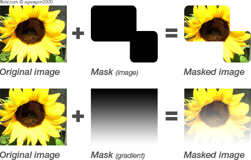
# -webkit-mask
图片遮罩层
none: 默认值,透明的黑色图像层,也就是没有遮罩层。- 支持透明底
图片url或者渐变背景
.mask {
  width: 200px;
  height: 200px;
  background: url(https://maginapp.github.io/static-website/images/font-records/css/free_stock_photo.jpg) no-repeat center / cover;
  -webkit-mask: url(https://maginapp.github.io/static-website/images/font-records/css/special-css-1-2-mask.png);
  /* 非透明无效 */
  -webkit-mask: url(https://maginapp.github.io/static-website/images/font-records/css/special-css-1-2-mask-2.png);
  -webkit-mask: -webkit-gradient(linear, left top, left bottom, from(rgba(0,0,0,1)), to(rgba(0,0,0,0)));
}
1
2
3
4
5
6
7
8
9
2
3
4
5
6
7
8
9
# -webkit-box-reflect
倒影效果
above、below、left和right四个关键词,支持mask属性
mask效果使用,可查看-webkit-mask

.el {
  -webkit-box-reflect: below 5px;
}
.el {
  -webkit-box-reflect: right 0 url(mask.png);
}
1
2
3
4
5
6
2
3
4
5
6
# 文献参考
← VSCode配置多行标签栏 sticky →